
Why Do We Visualize Data?
Anyone who has ever had to deal with rows and columns of numbers understands how simple it is to get misled by the vast volume of information. However, data is what allows us to understand our world. It enables us to interpret meaning, find patterns, connect ideas, recognize and understand trends, and come to wise decisions. Additionally, visualization opens the door to our “aha” moments. Here’s a quick exercise to understand why it’s vital to visualize numbers:
The table below displays quarterly sales data for three categories over a four-year period. Do you notice any patterns? Are there any visible differences in the patterns or trends among them? Do not worry if you cannot see anything clearly. It’s not just you.
You must look up and remember each value individually in order to read the table. However, to accomplish this, your short-term memory must simultaneously store and adapt multiple pieces of information. Unfortunately, this is not how short-term memories are created. The first digit will therefore be forgotten by the time you read the fifth or sixth one.
| Category | 2013 Q1 | 2013 Q2 | 2013 Q3 | 2013 Q4 | 2014 Q1 | 2014 Q2 | 2014 Q3 | 2014 Q4 |
| Furniture | $463,988 | $352,779 | $338,169 | $317,735 | $320,875 | $287,934 | $319,537 | $324,319 |
| Office Supplies | $232,558 | $290,055 | $265,083 | $246,946 | $219,514 | $202,412 | $198,268 | $279,679 |
| Technology | $563,866 | $244,045 | $244,045 | $461,616 | $285,527 | $353,237 | $338,360 | $420,018 |
| Category | 2015 Q1 | 2015 Q2 | 2015 Q3 | 2015 Q4 | 2016 Q1 | 2016 Q2 | 2016 Q3 | 2016 Q4 |
| Furniture | $307,028 | $273,836 | $290,886 | $397,912 | $337,299 | $245,445 | $286,972 | $313,878 |
| Office Supplies | $307,028 | $183,631 | $191,405 | $217,950 | $241,281 | $286,548 | $217,198 | $212,870 |
| Technology | $333,02 | $291,116 | $356,243 | $386,445 | $397,201 | $386,387 | $359,656 | $375,229 |
Now, let’s try incorporating trend lines, as shown.
Suddenly, the trends are crystal clear. In all but two quarters, office supplies have been the least popular product category. Furniture trends show a steady decline, with the exception of a surge in sales during the fourth quarter of 2015 and an increase in numbers during the previous two quarters. Although initially very unstable, technology sales have generally been the highest over the period.
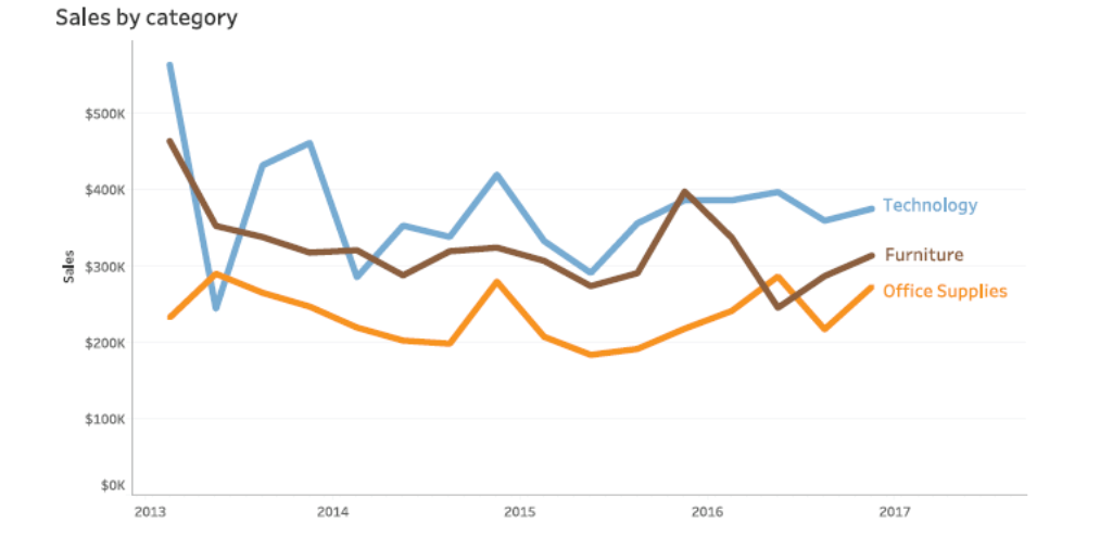
The same 48 data points are taken into account in both the table and line charts. The line chart, however, reveals the trends within the data by dividing the 48 data points into three separate items of data, each consisting of 16 points. By putting large data sets into visual form, you can access your short-term memory and gain new, insightful perspectives.
How to tell stories with data in eight steps
It is necessary to take specific actions in order to plot a story from any given set of data. The art of storytelling requires iteration and practice. Let’s go over each detail needed to understand how to depict the story on the screen in our presentations.
- Understand the context
- Understand the data
- Choose an appropriate visual display
- Color theory
- Eliminate clutter
- Focus attention where you want it
- Think like a designer
- Tell a story
1. Understand the context
Context is necessary for understanding data; without that, whatever visualisation you create will not offer any insightful information.
Using data without any knowledge of it other than its values is equivalent to hearing an abbreviated quote from a third party and using it as the main point in a document. There is a very real chance that you’ll discover after the fact that the narrator didn’t mean what you initially believed.
You must know the who, what, when, and how — the metadata, or the data about the data — before you can know what the numbers are actually about.
Who?
A good way to narrow down your audience is to identify the decision-maker. Knowing more about your audience will put you in a better position to understand how to connect with them and craft a requirement that both meets their needs and yours.
What?
In a nutshell, you want to know what the data is all about; and to do that, you need to know what surrounds the numbers. Talk to subject matter experts, read papers, and study accompanying documentation.
When?
Data is usually linked to time. For instance, it might be a time series or a snapshot from a specific period. In both cases, you have to know when the data was generated. An estimate made decades ago does not hold true in the present. This seems obvious, but it’s a common mistake to use old data to make a current decision. Things change, people change, places change, technology changes and so, naturally, data changes, too.
How?
Only after you can clearly articulate who the audience is and what you need them to know or do, can you turn to the data and decide which data can help make your point? In a very real sense, data is the supporting evidence to the story you will tell.
2. Understand the data
When dealing with datasets, the category of data plays an important role in determining which pre-processing strategy would work best for a particular set or which type of analysis should be applied for the best results.
Let’s dive into some commonly used categories of data.
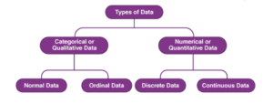
Data that may be categorised is referred to as qualitative data or categorical data. Data that is qualitative is not numerical. In categorical information, categorical variables are used to define characteristics like a person’s gender or hometown. In contrast to numerical definitions, categorical information is typically defined in terms of plain language specifications.
Although categorical data occasionally contain numerical or quantitative values, they are of little use in mathematics.
The year of birth, favourite sport, school postcode, etc. are some examples of categorical data. Here, the date of birth and the zip code of the school contain the quantitative value but do not have a numerical significance.
Categorical or Qualitative Data
Nominal
These values are the ones that lack a natural order. Let’s use some instances to better grasp this. For example, the colour of a smartphone could be considered a nominal data type since it cannot be compared to another colour.
For instance, it is impossible to imply that Red is better or worse than Blue. Similar to this, a person’s gender cannot accurately describe the distinction between male, female, or other. Nominal data kinds also include mobile phone categories, whether they are in the midrange, low-budget, or luxury smartphone segments.
Ordinal
Ordinal data or an ordinal value is defined as information that advances in the natural order. Nominal data have the important characteristic that the difference between the data values cannot be established. Such variables are frequently employed in surveys, finance, economics, etc.
Quantitative or Numerical Data
Quantitative data is also known as numerical data that represents numerical value (i.e., how much, how often, how many). Numerical data, such as height, length, size, weight, etc., give information about the quantities of a specific thing.. Based on the data sets, quantitative data may be divided into two categories: discrete data and continuous data.
Discrete Data
Integers, often known as whole numbers, are the numerical values that fall under this category. Discrete data examples include the number of speakers in a phone, the number of cameras or cores in a processor, the number of compatible sims, etc.
Continuous Data
The data that can be calculated known as continuous. Continuous data can take any one of an infinite number of possible values within a certain range.
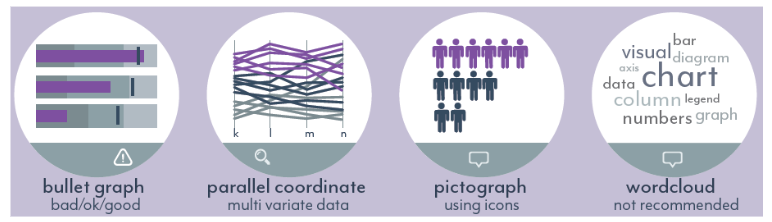
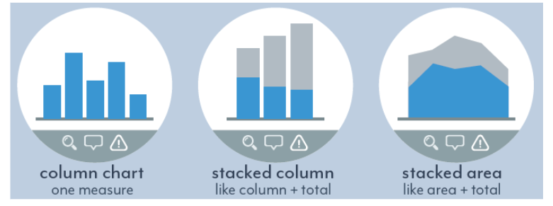
3. Choose an appropriate visual display
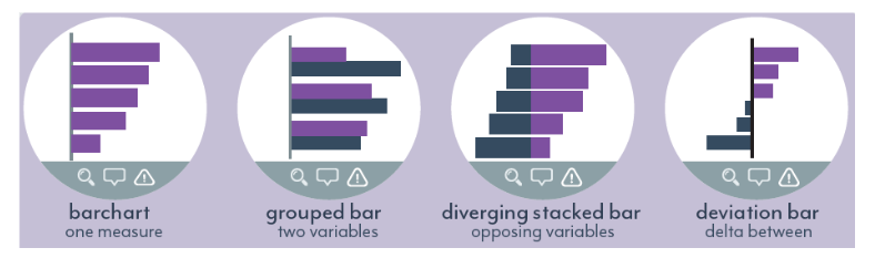
There are many different graphs and other visual representations of data; the chart you choose should reflect the information you want to present. The selection criteria of the graph are shown in the graph below.

1. Show comparison between categories: When comparing nominal data, such as the names of persons or products, category comparison is utilized. You are simply observing one point in time in this situation.

For Instance, If you wish to show,
+ the total revenue generated by the members of your sales
department over a year, you can use a bar chart.
+ the outcome of a questionnaire that has answers as ‘like’ and
‘unlike’, you can use a diverging stacked bar chart.
+ the year-to-date value of different KPIs in relation to their
target you can use a bullet graph.
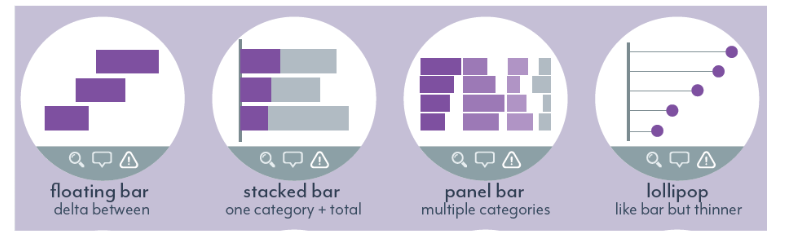
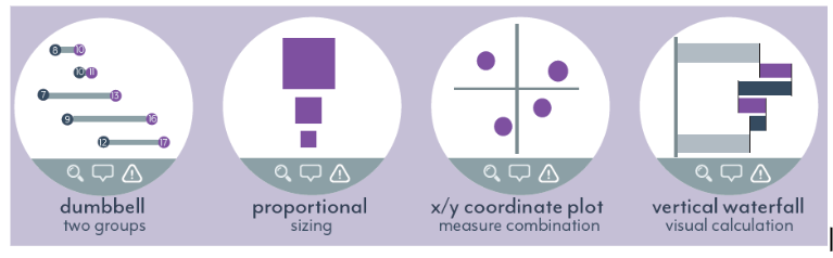
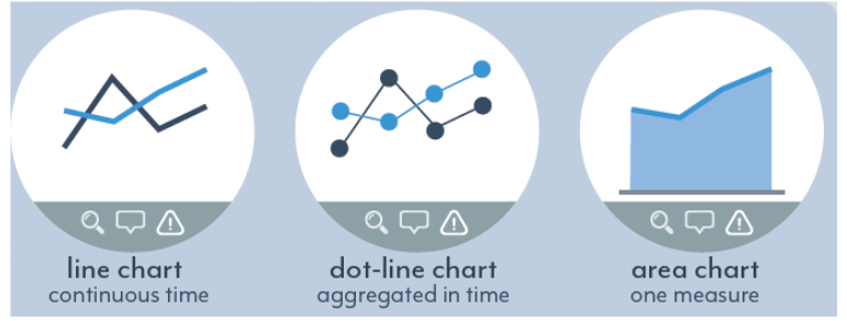
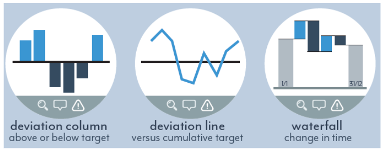
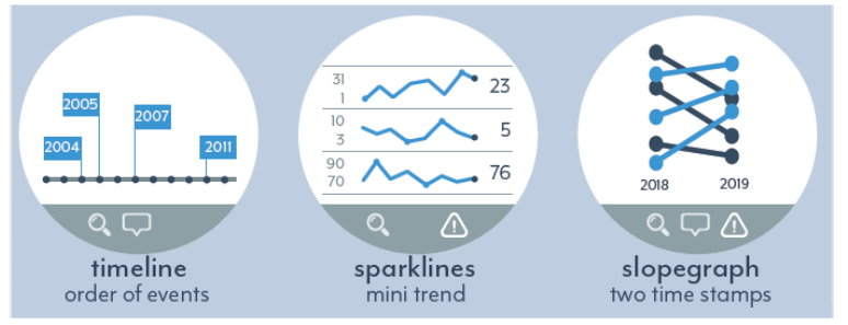
2. Show development over time or a trend: When you want to show the change in category A and B over time.

For instance, if you wish to show…
+ the revenue per month generated by the members
of your sales department over the last quarter, you can
use a line chart.
+ the ranking of a sports competition over changed the
past year, you can use a slope graph.
+ how a single KPI scores better or worse than its
target, for every single month in the last year, you can
use a deviation column chart.
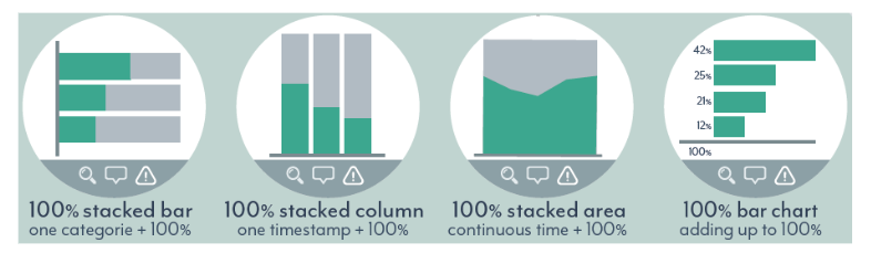
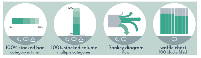
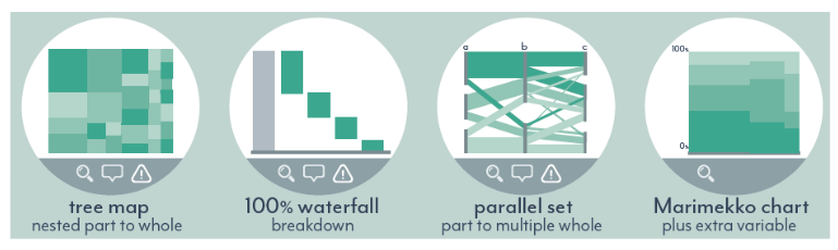
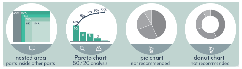
3. Show relation of a part to the whole: When you want to show how A, B, and C add up to the total of ABC.

For instance, if you wish to show…
+ the market for sports cars is split into different car
brands, you can use a 100% bar chart.
+ which subpage of your website viewers of your
homepage can go to, you can use a Sankey diagram.
+ the energy left in your phone, you can use an image fill
to show the percentage value.
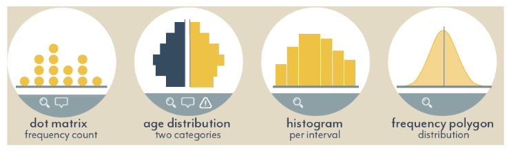
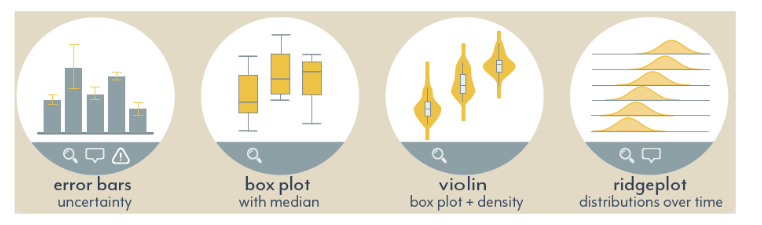
4. Show the distribution of your dataset: When you want to show how often A, B, and C appear in the dataset.
For instance, if you wish to show…
+ how often the letters ABCHRT appear in the word bar chart, you
can use a dot matrix
+ the differences in salaries between different age groups ina
company, you can use a box plot
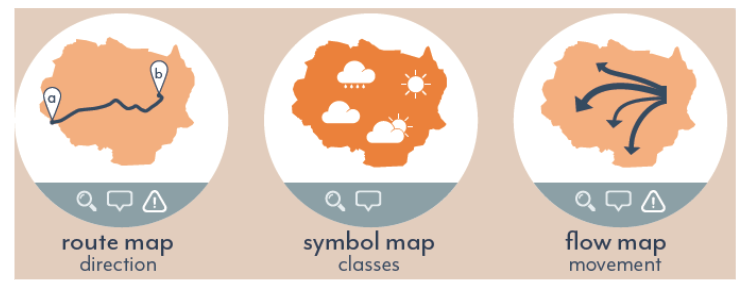
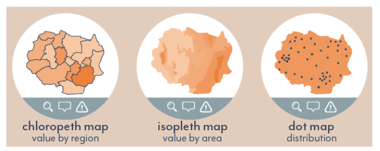
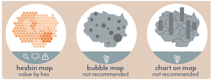
5. Show the geospatial position of your dataset: When you want to show where your data points are located on a map.

For instance, if you wish to show…
+ the route between two locations you can choose a route map
+ the number of people that live in a region you can choose a
Chloropeth map
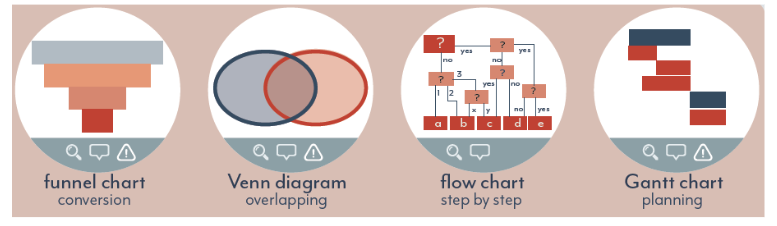
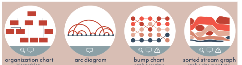
6. Show the relationship or hierarchy between data points: When you want to show how A, B, and C relate to each other.

For instance, if you wish to show…
+ that the colors red and blue exist as individual colors, but if you
combine them, you’ll get purple, then you can use a Venn diagram.
+ the outcome of a series of choices can be shown using a flowchart.
+ how the ranking of teams changes over the duration of a
competition, you can use a bump chart.
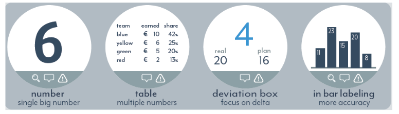
7. Show KPI data: When you want to show a single value or flat number

For instance, if you wish to show
+ the total sales or revenue
+a single big value
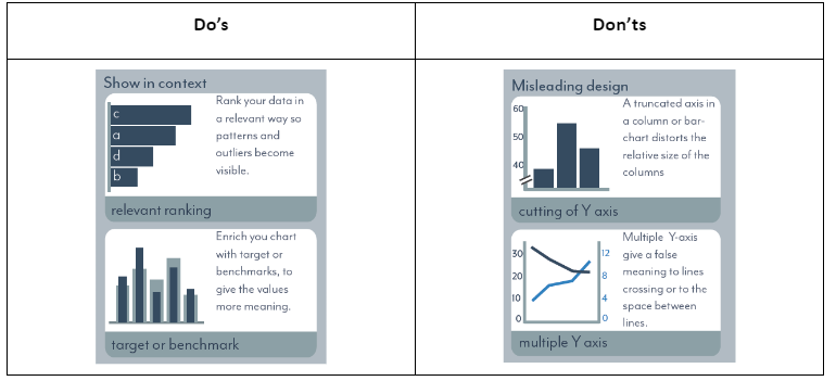
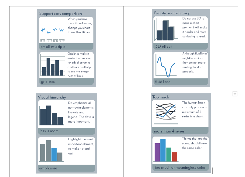
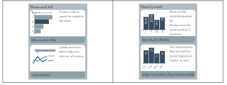
Let your data speak: Do’s and Don’ts
1. Color theory
The use of colour affects its efficiency in an opposite manner. Less can be more. The best colour to use when beginning a fresh design is grey. Color should only be gradually added in places where it effectively conveys important information.
Color can draw attention to what is important. It also can tie things together that belong together.
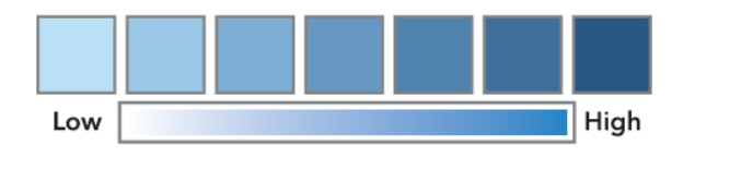
Sequential schemes: suitable for data that that progresses from low to high
Diverging schemes Give the extreme low end of the range the most attention and the extreme high end the least. Such a colour scheme would be an appropriate way to decode a budget-versus-performance graph, where both severe overspending and extreme underspending need to be highlighted.

Categorical contrasting colors for individual comparison.

Highlight colors use to focus on important points.

Alert color use to warn the reader.

5. Eliminate clutter
It can be tempting to include every relevant chart or graph when creating the first dashboards. Avoid falling for that trap.
Instead, eliminate as much as you can while maintaining the insights. Finding the “best” version may need several revisions. With this in mind, give any dashboard you’ve designed a new look to see if there’s any clutter you can get rid of or anything you can move around to enhance clarity.
Use the tool functionality to avoid the information overload on the home page; options like filter, drill down, tooltip, and drill through are all available.
6. Focus attention where you want it
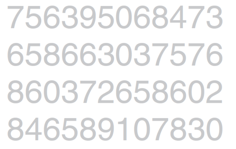
Consider the following example. Users want to know how many times in the chart the number three appears. To process all the information if they looked at each number individually would take a long time. So, put the focus on where you want to draw your viewers’ attention.
But check out what happens when you make a single change to the block of numbers. Now repeat the exercise of counting the 3’s using the chart, below.
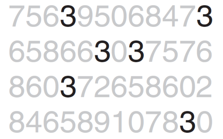
Please take note of how much simpler and quicker the same task is when utilizing the revised chart. You don’t have time to blink, and you don’t even have time to think. Suddenly, six 3s appear in front of you. This is so apparent, so quickly.
Visual position on the page:
Most viewers start at the top left of the image and scan down the page or screen in zigzag patterns unless there are clear visual clues.
As a result, organise the picture in a zigzag pattern, ranking the importance of each piece of information.
7. Think like a designer
Consider what you want your audience to be able to do with the data as a starting point (function). And design a visual (form) that will make it simple for people to understand this.
Few key points:
- Highlight the important stuff
- Eliminate distractions
- Create a clear visual hierarchy of information
- Don’t overcomplicate
- Follow the proper labeling protocol
- Leverage white space.
- Show visuals side by side
- Provide multiple options and seek input.
8. Tell a story
Any excellent play, film, or book captures the beauty of storytelling. Good stories capture the audience’s interest and lead them on an exciting journey that makes it challenging to put them down or stop reading. A day, a week, or even a month after finishing it, you could simply explain it to a friend.
And you could ignite such energy and emotion in your audiences. Storytelling is a time‐tested structure; humans have been communicating with stories throughout history. And this can be a powerful tool in business communications too.
The Narrative structure: The flow and order of the story are very important because the audience must be able to relate the relationships between the data as they move from dashboard to dashboard.
Consider the order with which you want to tell your story and how you want your audience to experience it. What sort of an audience are they? Busy audiences might better appreciate directness, i.e. leading with what you want from them? New audiences that you need to establish credibility with? Audiences that may or may not care about your process. Perhaps they just want the answer? Is the story going to be a collaborative process that requires their input? Do you want them to make a decision or take an action? How do you convince them to act in the way you want? These questions will provide the answers to help you determine which narrative flow would work best, given your specific situation.
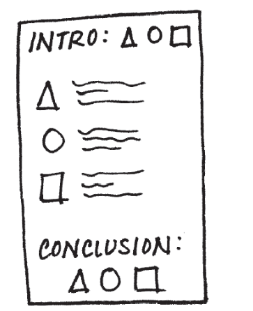
The order of a well-told story
- the introductory paragraphs
- the actual content
- the conclusion
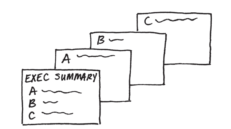
Horizontal Story
Using horizontal logic, you can browse through the details pages by placing relevant content on the main page.
Example: An executive summary dashboard is the main page with a high-level KPI corresponding to a subsequent dashboard title in the same order. This is a nice way of setting it up so your audience knows what to expect, and is then taken through the details
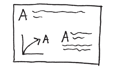
Vertical logic describes a dashboard’s data as being self-reinforcing. The dashboard has all-important KPIs plotted on top, and the remaining information is a slice-and-dice of those data.
Making use of both horizontal and vertical logic at once will make sure that the message you wish to convey in your communication is understood.er
In Closing
A story may be enchanting. They have the ability to hold our attention and remain with us in a manner that facts alone cannot. They provide order. Utilizing this potential while creating your messages makes total sense.
Put a beginning (story), a middle (twists), and an end to your stories (call to action). Remember that your audience should always be the main character of the story you tell. We can make sure the tale is about them, not about us, by making the audience the protagonist. Because it becomes a turning point in our tale when the information we present is pertinent to our audience. You won’t merely be displaying data anymore. Instead, you will be using statistics to tell a story.
Reference: –
- Diagram 1 – The big book of dashboards (Visualizing your data Using real-world business scenarios) by Steve Wexler, Jeffrey Shaffer, Andy Cotgreave
- Diagram 2 – The big book of dashboards (Visualizing your data Using real-world business scenarios) by by Steve Wexler, Jeffrey Shaffer, Andy Cotgreave
- Diagram 3
https://byjus.com/
4 Types of Data – Nominal, Ordinal, Discrete, Continuous | Great Learning (mygreatlearning.com)
- Diagram 4 to Diagram 9
https://www.shangyexinzhi.com/article/4502919.html
- Diagram 10
https://www.storytellingwithdata.com/blog
- Diagrams 11.1 to 11.3
https://www.storytellingwithdata.com/blog/2020/5/6/picking-the-right-colors
The big book of dashboards (Visualizing your data Using real-world business scenarios)
- Diagram 12 to 16.2
Cole Nussbaumer Knaflic’s storytelling with data book.
Curtsey to: –
- Cole Nussbaumer Knaflic’s storytelling with data book.
- The big book of dashboards (Visualizing your data Using real-world business scenarios)
- Cool Infographics by Randy Krum.